Tommy John · Navigation Redesign
Redesigning navigation for 1M+ monthly shoppers.
As one of two designers on the UX team, I led research and design for a navigation redesign at Tommy John, a comfort-focused lifestyle brand serving 1M+ monthly users across web and mobile.
UX Designer
Led research, information architecture, and design
2019–2020
As Tommy John's product catalog grew, navigation became harder to use, hurting conversion across categories. The core question: how could users more easily find and discover products?
Redefined the information architecture and designed a responsive, multi-level navigation with visual product imagery, achieving a 92% success rate at finding a product, 12% higher than the old structure.
We started with analytics review and user interviews to surface pain points in the existing navigation. Three findings shaped our direction:
Research synthesis — mapping findings from analytics and user interviews.
Existing mobile navigation: text-only, requiring multiple taps to reach a product category.
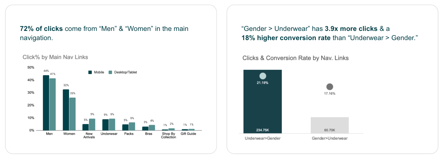
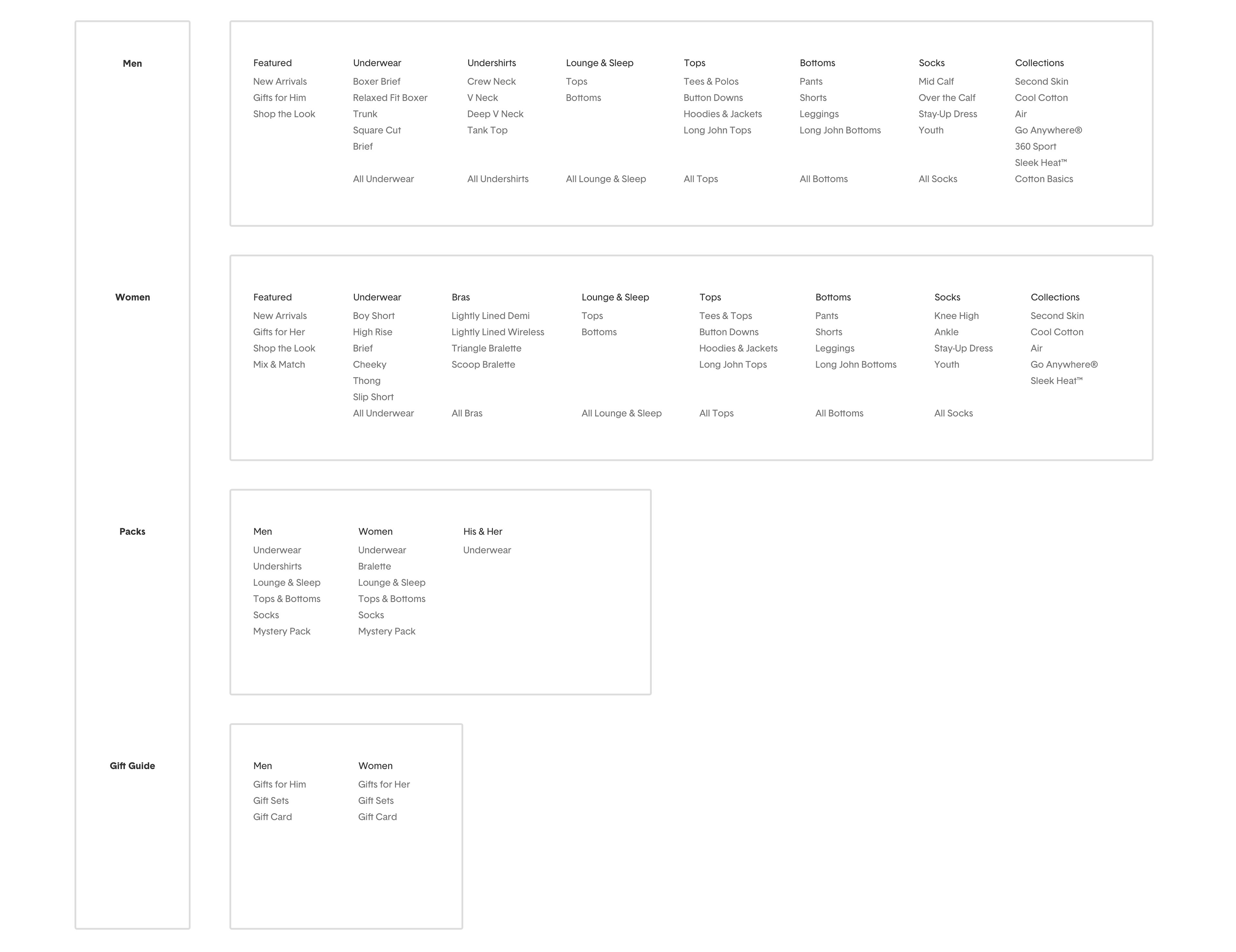
Analytics confirmed users primarily shop through 2 gender-based links — yet the nav had 6 top-level categories.

The original navigation structure — 6 main links with significant category overlap across genders.
We created two personas representing the core customer segments to keep design decisions grounded in real user needs throughout the project.
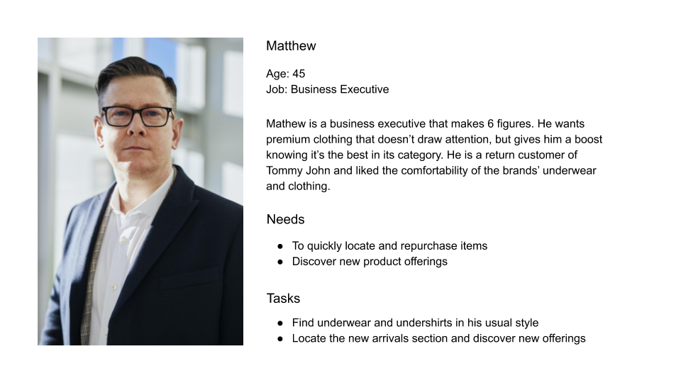
Mathew — a returning male customer who knows what he wants and values quick, efficient navigation.
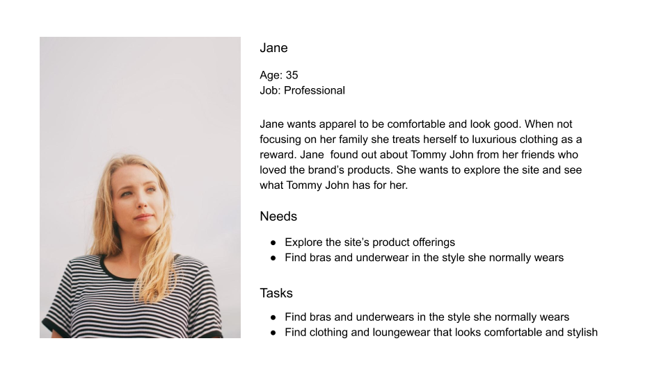
Jane — a new female customer discovering Tommy John, who benefits from visual guidance to compare styles.
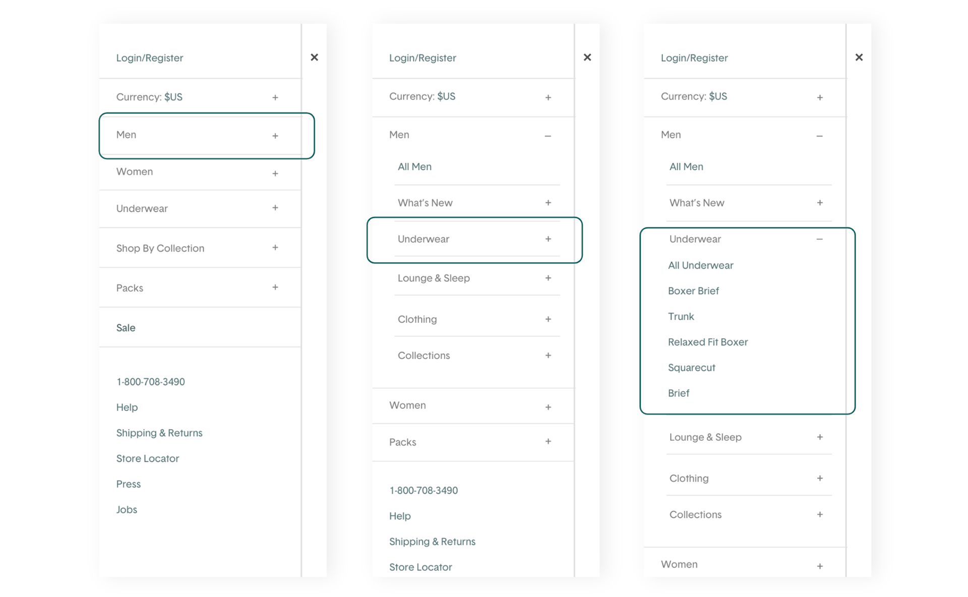
We proposed 2 main changes to the existing navigation structure — reducing top-level links and organizing by gender first to match how customers actually browse.
Proposed IA — gender-first hierarchy with consolidated categories.
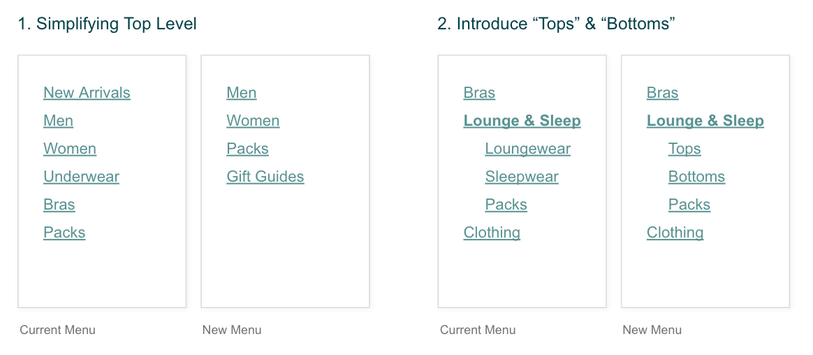
The two structural changes: consolidating 6 links into a gender-led model and reducing category duplication.
We explored three design directions before testing with users. The winning approach paired the new IA with visual product imagery to serve both new and returning customers.
Option A: text-only multi-level menu.
Option B: text with hover imagery on desktop.
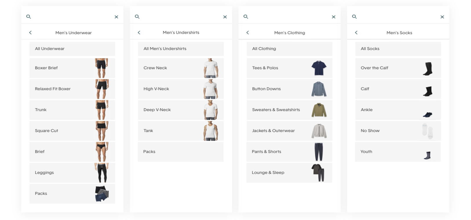
Option C: multi-level menu with visual product category images — the selected direction.
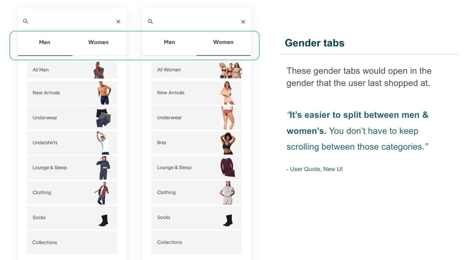
Gender tabs — the primary entry point into the new navigation structure.
We ran two rounds of testing with 144 total participants via UserZoom to validate both the proposed IA and the new UI before launch.
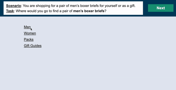
Tree testing via UserZoom — participants navigated the proposed IA to find specific products.
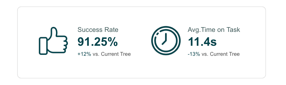
Tree test results: new structure delivered 12% higher success rate and 13% faster time on task vs. the existing nav.
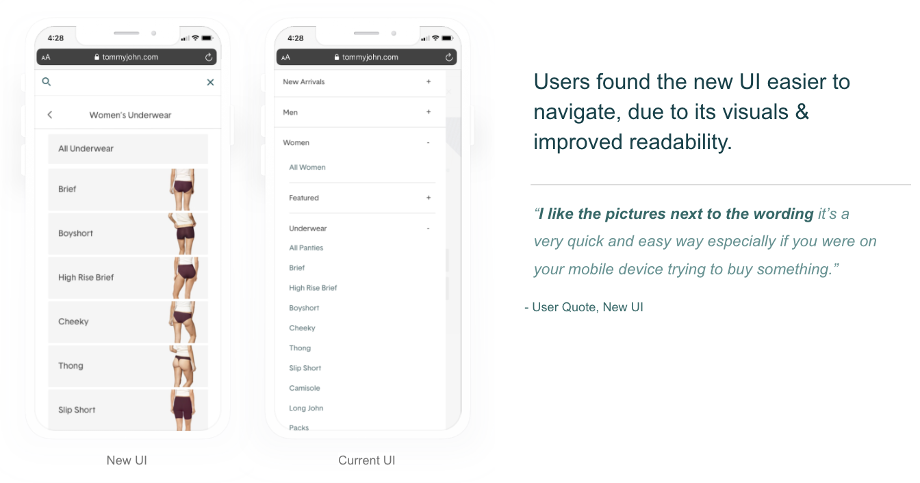
A/B usability test results — participants found the new UI significantly easier to navigate.
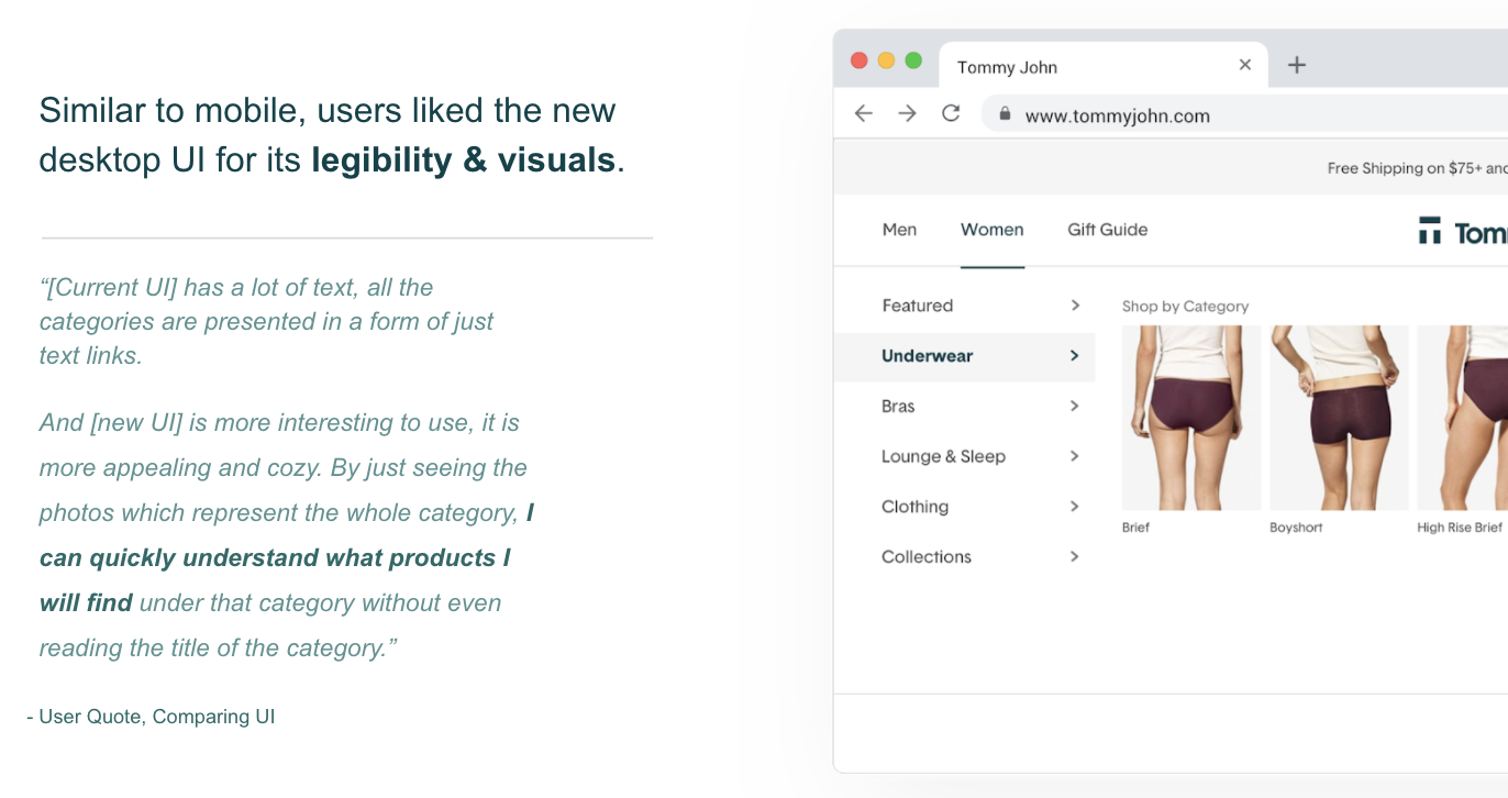
Qualitative feedback from desktop usability sessions supported the preference for the image-driven design.
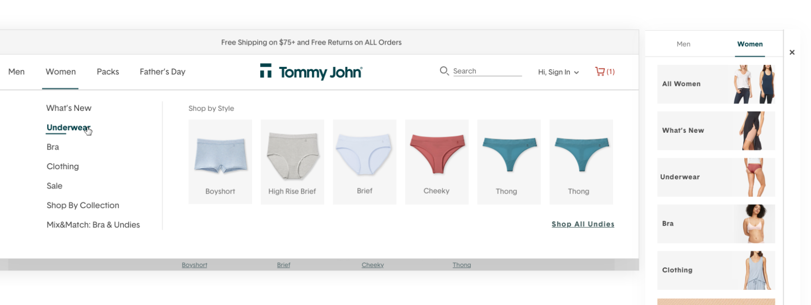
The redesigned navigation launched in early July 2020 with visual product category images throughout. The new system let the operations team add imagery next to any product category — supporting both discoverability for new customers and efficiency for returning ones.
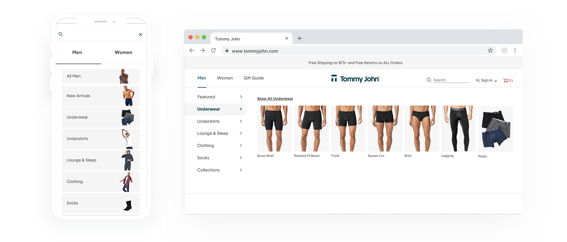
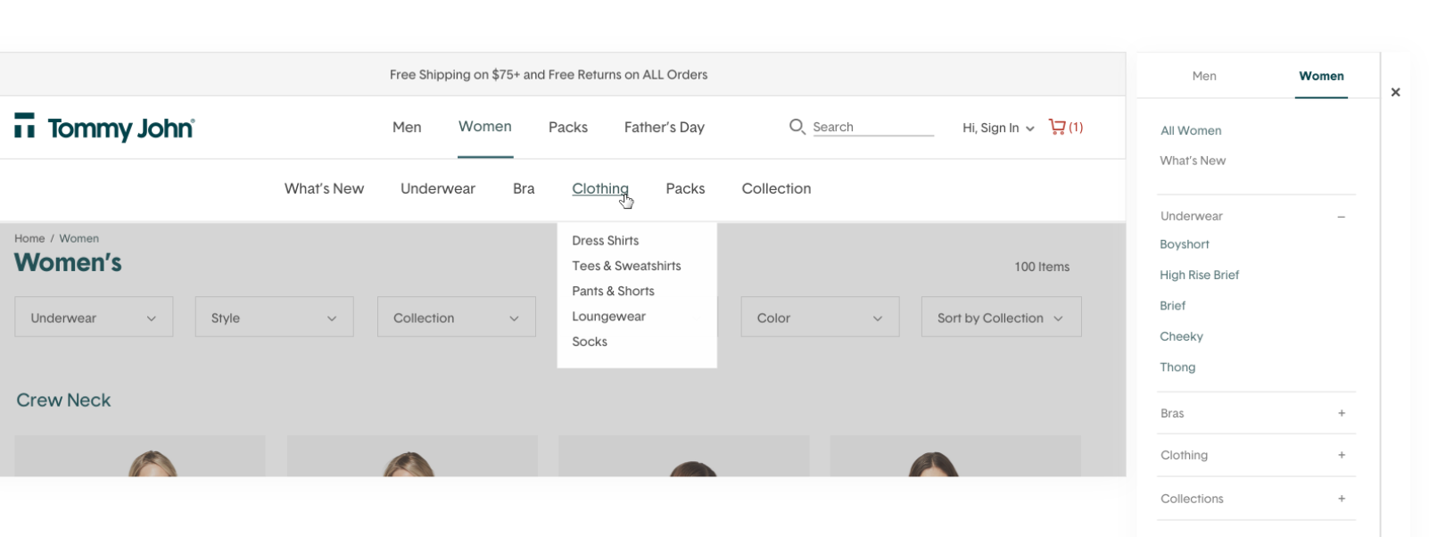
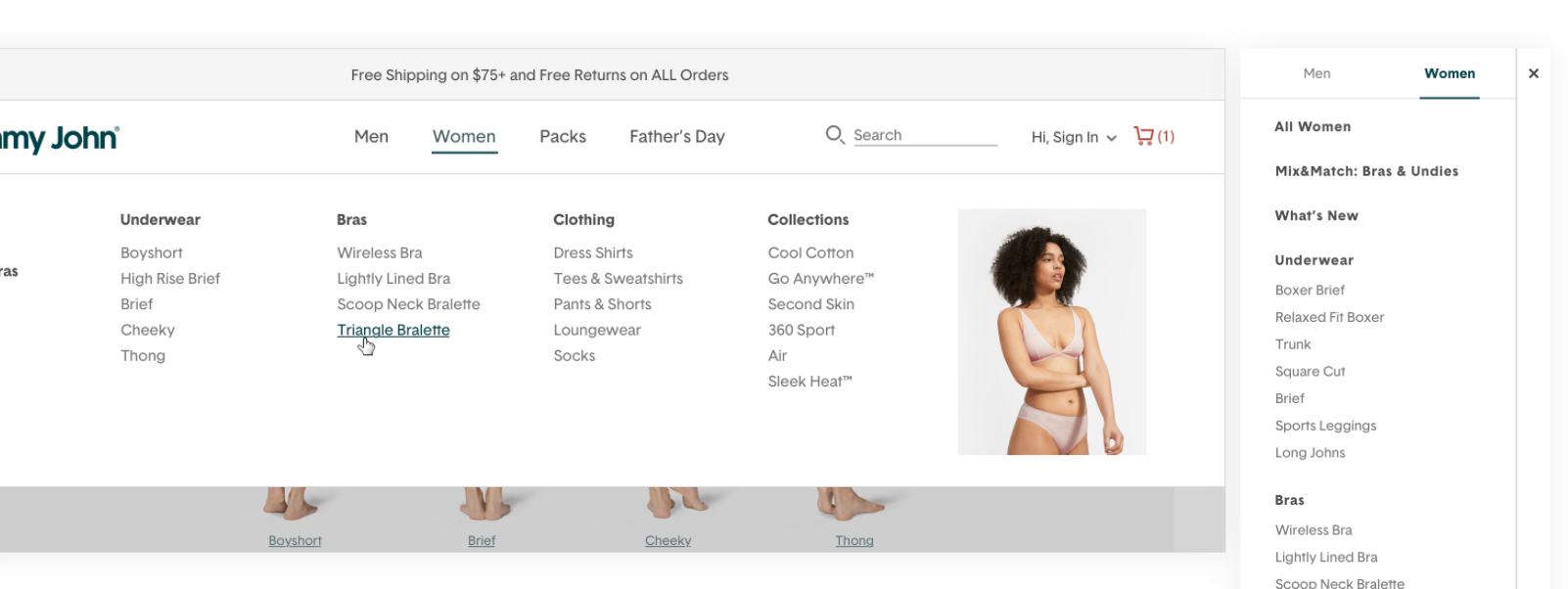
Final designs — gender-first navigation with visual product category images across mobile and desktop.
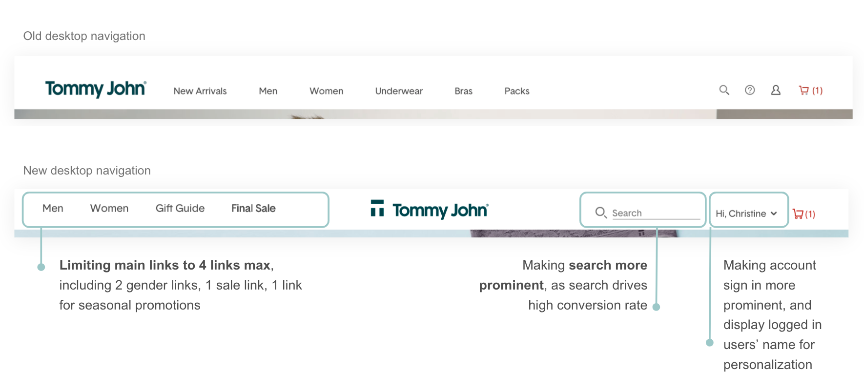
Desktop main nav — before and after, showing the shift to a visual, gender-led structure.
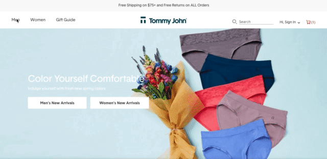
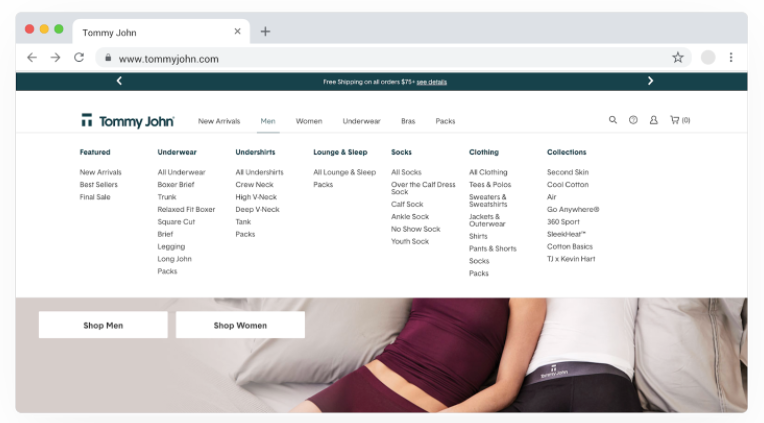
The live navigation on tommyjohn.com after launch.