MGM+ · Details Page
Redesigning the details page across web, mobile, and 5+ TV platforms.
As lead designer, I identified inconsistencies in the details page experience across platforms and led a full redesign, defining the design system and overseeing implementation across web, mobile, and 5+ TV platforms.
Lead Product Designer
Led design system definition and cross-platform implementation
2022–2023
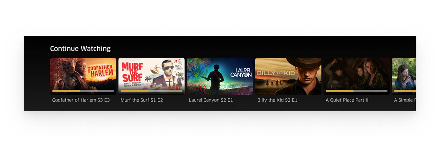
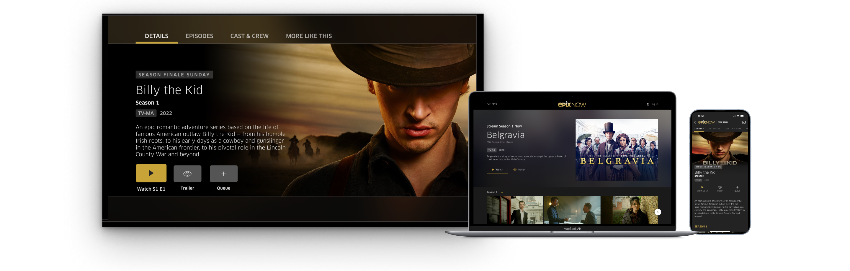
With ~85% of users selecting titles from the first four positions of the continue watching carousel, the details page was a critical retention moment — yet it had inconsistent UX, limited button states, and navigation friction across platforms.
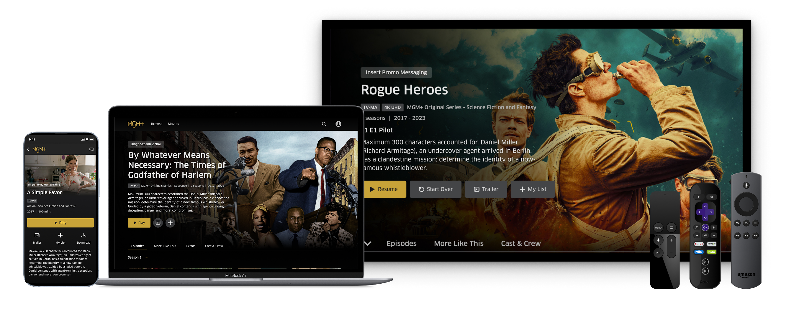
Redesigned the details page with an expanded hero image, dynamic states for different user scenarios, and platform-optimized navigation, unifying the experience across all platforms. The redesign drove 88% details page to watch conversion and established a flexible design system that absorbed new features in 2024 without major layout changes.
I was tasked with adding a progress bar to the continue watching carousel — given that this experience is critical for retention and HPC (hours per customer watched), with ~85% of users selecting titles from the first four positions.
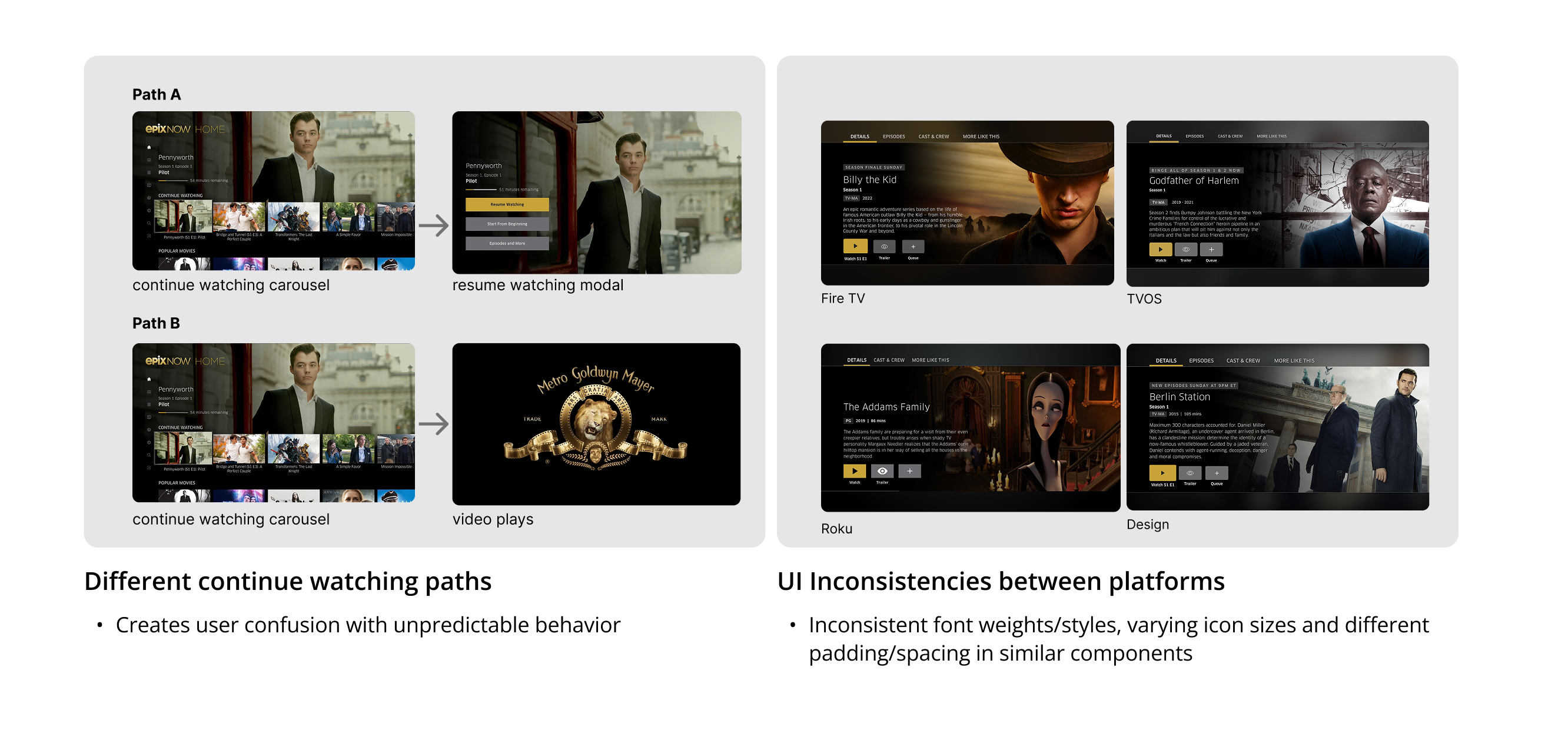
While evaluating the continue watching experience, I discovered broader inconsistencies across platforms that went well beyond the original request.
When analyzing competitors, I identified that we lacked button state variations — showing a single 'Watch' CTA for both new and already-watched content — and key metadata display, especially for resume watching content.
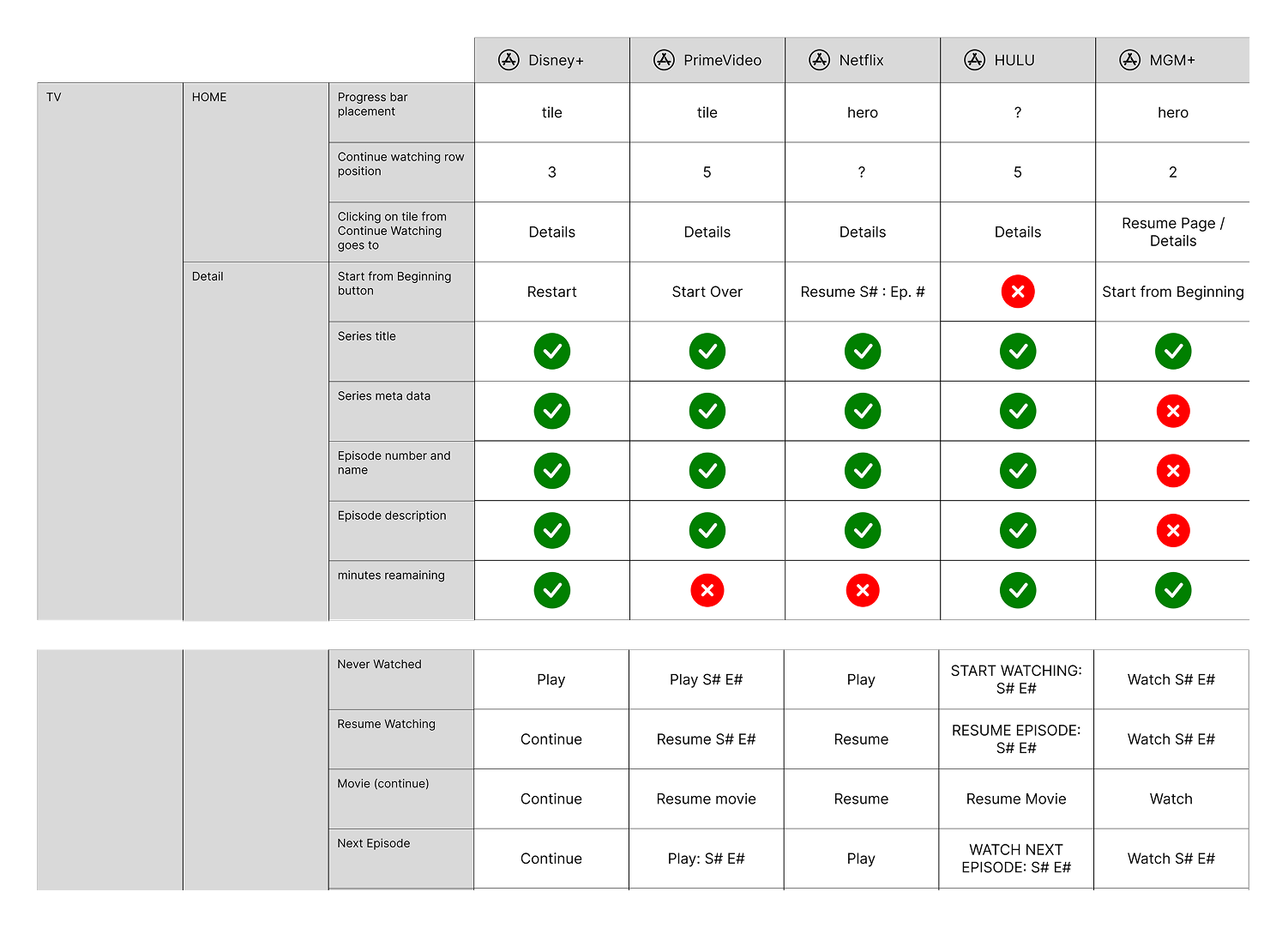
Competitor analysis highlighting gaps in button states and metadata presentation.
Existing designs across platforms revealing inconsistencies in layout, typography, and navigation patterns.
Continue watching led to either a modal or the player, creating unpredictable behavior and user confusion.
Different layouts and styling across platforms eroded brand trust and created development overhead.
A single 'Watch' CTA didn't reflect different user scenarios — watch, resume, or subscribe.
Top navigation placement on 10ft platforms caused confusion, deviating from standard TV UX patterns.
Worked closely with development and product teams to evaluate feature priorities based on effort and impact. I advocated for the expanded scope by presenting the inconsistency findings and the competitive gap analysis, making a clear case for a full details page redesign rather than a one-off progress bar addition.
Design considerations across platforms included metadata display, user states and content entitlement, gradient system, and improved navigation patterns tailored to each platform's interaction model.
Redesigned details page across web, mobile, and TV platforms with a unified design language.
Designed for various user scenarios, changing buttons and metadata shown based on the user's state and content entitlement.
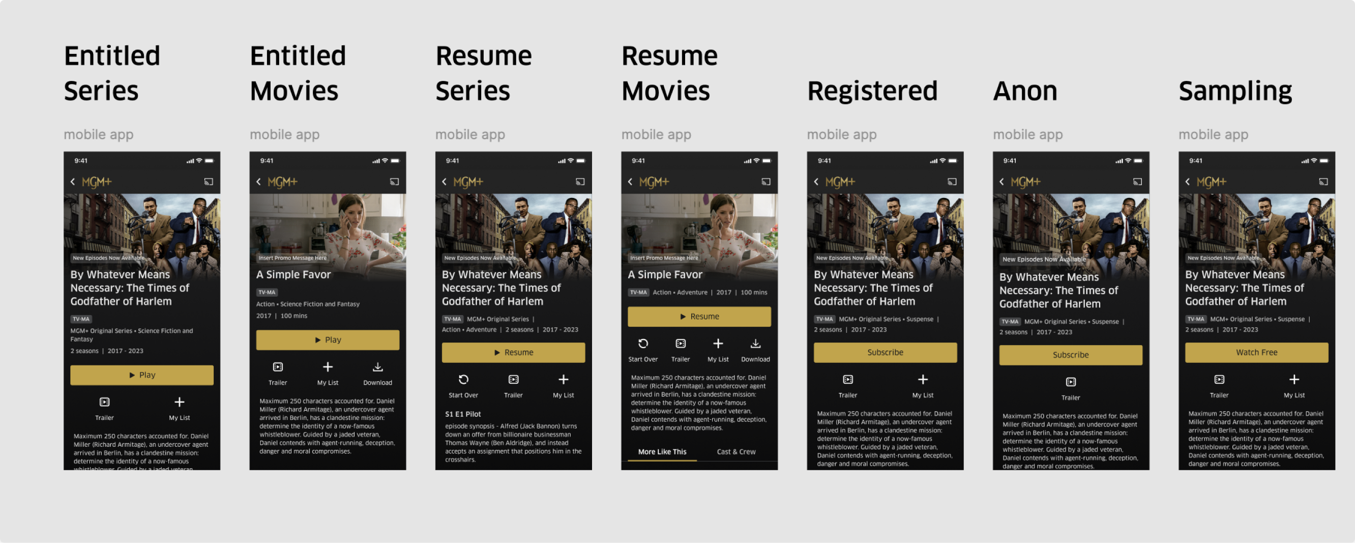
All seven user states designed to surface the right CTA and metadata at the right moment.
Introduced accessibility annotations in the design process — ensuring developers had clear guidance on focus order, ARIA labels, and contrast ratios from the handoff stage.
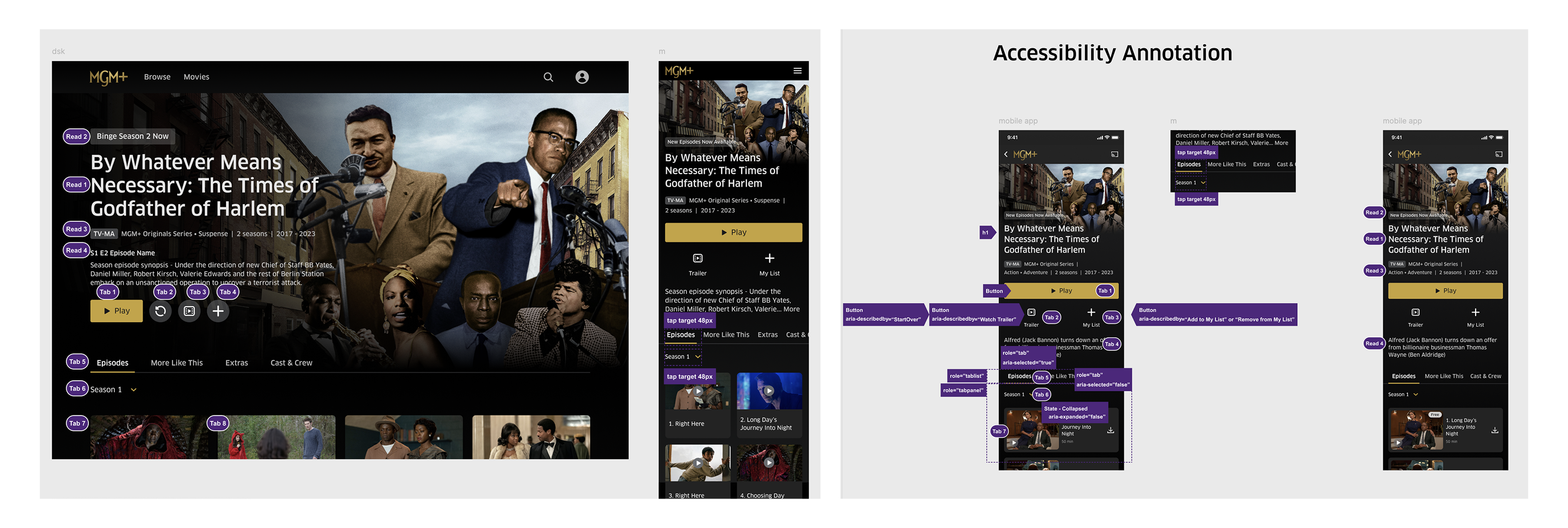
Accessibility annotations embedded directly in design specs, covering focus management and screen reader labels.
Since launching in 2023, we've continued to enhance the details page with new features like IMDB ratings and title treatment implementation — testing the scalability of the original design system and validating that the architecture held up under new requirements.